Statera Cellars | Logo Refresh, Label Design, & Illustration | Solo
Wine not goddesses?
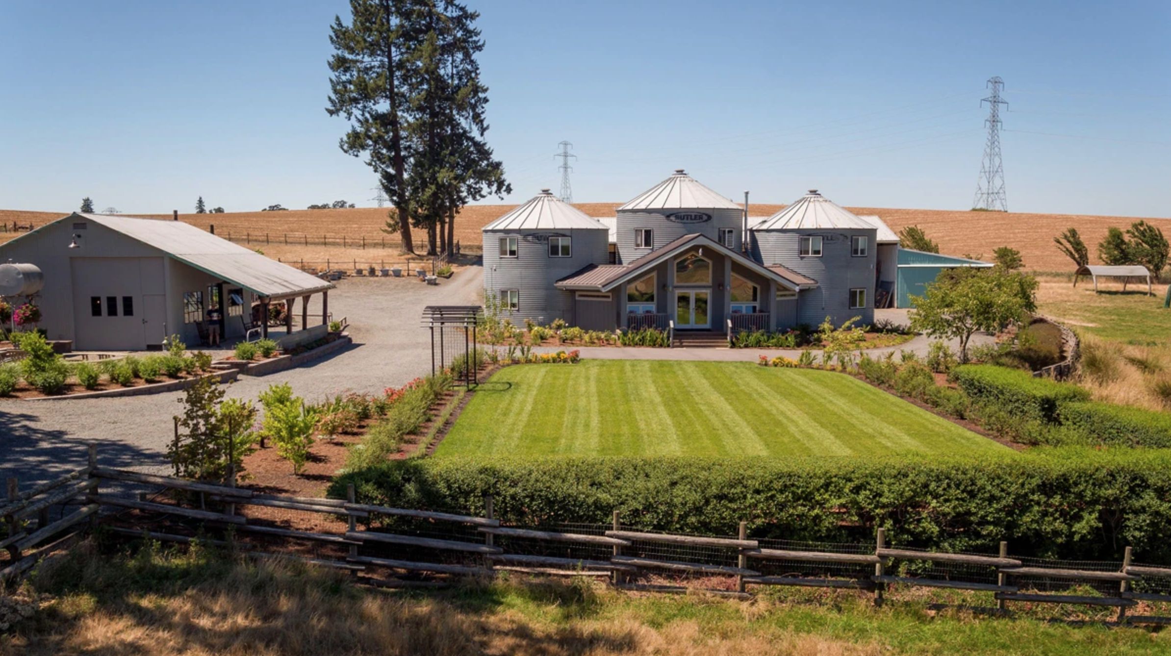
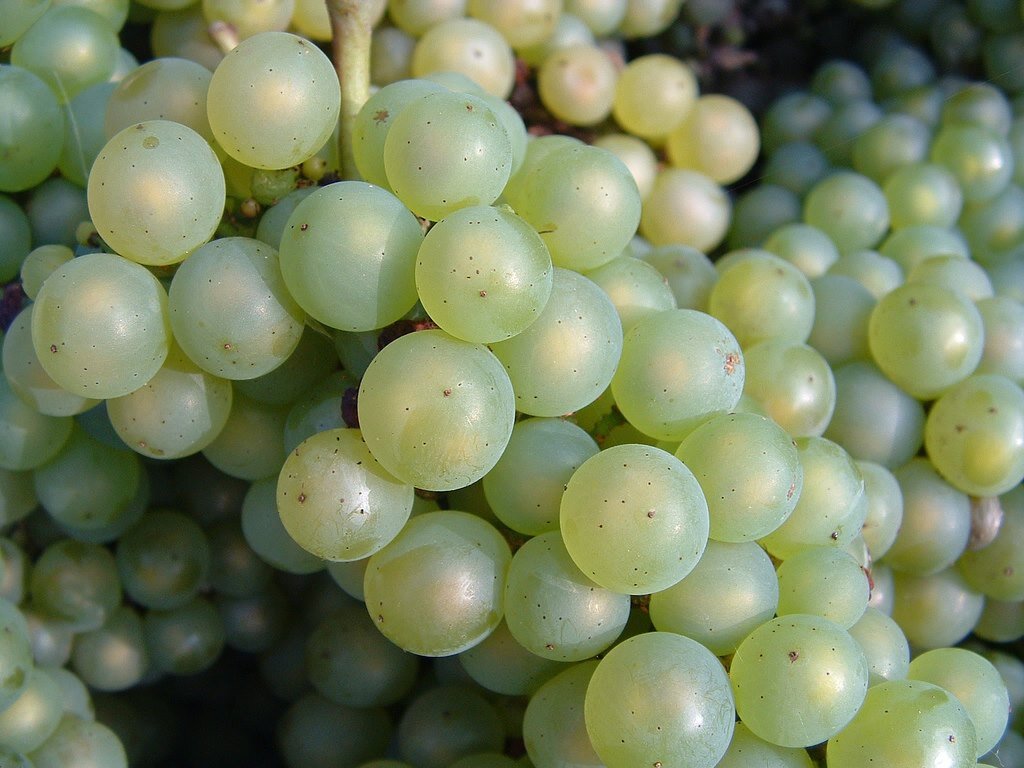
Statera Cellars is the first all chardonnay winery in the Willamette valley, practicing natural and traditional winemaking technique.
Background
Statera Cellars is owned and operated by two friends, Meredith Bell and Luke Wylde. Their mission is to make delicious, honest chardonnay from the most distinct vineyards in the region. They are the first winery in the Willamette Valley to exclusively make chardonnay—they love the grape and want to showcase its potential and diversity in the pacific northwest. Their wines are made using natural and traditional winemaking practices, resulting in wines that are compelling and markedly alive.
Luke had fallen in love with a poster I illustrated for a dance party, and directed me to ‘do whatever you want.'
As cool as that level of freedom sounds, I needed to know more about the ‘why’. So he invited me to the farm and introduced me to each wine I’d be labelling. During this very fun conversation, it occurred to me that Luke referred to each wine in the feminine. “She’s funky” … “She’s bright and sparkly” … And so on.
That discovery, combined with their natural technique and affinity for ancient Rome and Greece (Statera means Balance in latin), sparked the idea to personify each wine as the Goddess of What Makes Her Special.
Mother nature meets mythology. Now we’re cooking with gas.

Logo
They didn’t originally ask me to rework their logo, but I felt like it could use an update if we were going to totally renovate their shelf appeal.
The symbol seen here is the greek symbol for equilibrium, and it was very important to keep because its integral to their philosophy. I decided to truncate and center it so that it could be work as a balanced, standalone mark as well. I also kept the sturdiness of the logotype, but selected a font with more natural-feeling nuance, and I nixed the outline/drop shadow.
Part of the direction was to create label art that could also be used on merch. So I approached this as if I were making big, beautiful screen printed art posters, that just so happened to also be labels.
The Ladies

Petillant Naturel
First on the list was Pet Nat. She’s their Sparkling Chardonnay with slightly sour, floral notes of citrus blossom and jasmine.
She was described as the belle of the ball. Vivacious, bouncy, bright, and playful. They used the word ‘kaleidoscopic.’ So I took that and made her the Goddess of Jasmine and Charisma.

Synergy/Imber
Next up is Imber. Internally they call her Synergy, because thats what she is: a blend of 3 vineyards chosen specifically because of how well they work together to create a universally lovable table wine — with notes of apple and walnut.
She was described as everyone’s confident, dependable, best friend. A perfect complement. They compared her to Hekate, the three-headed, butterfly-winged, pegasus-loving Greek goddess who favors the fortune of mankind.
In lieu of 3 heads, I chose three dancing bodies sharing one head, because she is, after all, the Goddess of Cooperation. Some limbs overlap to create a new color, just like the grapes combine to create new flavors.

Cutis
Cutis is their orange chardonnay, meaning the skin is left on the grapes as they ferment. She’s funky, tanniny, and structured —not a universally lovable sweetie pie like the Imber.
She was described as a bad ass. Tough, sinewy, regimented, and brave. Definitely not delicate. I decided to make her the Goddess of Fierceness and Snakes, because it felt like the most bad-ass, skin-centric accessory for her to command.

Rudis
Rudis is the most natural, untouched Chardonnay they make. Just grapes and time, and whatever happens happens.
She is earthy and full-bodied. She was described as feral, innocent, and vulnerable. When asked to free associate with plants and colors, they immediately came up with mushrooms and cornflower yellow.
I decided she was the Goddess of Curiosity and the Forest Floor. Mushrooms and yellow, combined with her untamed nature and the Pacific Northwest, made chanterelles her obvious accompaniment.

Multa
Multa is a very special wine. 4 vintages of the same grape combine to create a beautifully aged symphony of contrasting characteristics. There’s a lot going on here. They described her as multi-generational, time-oriented, and seasonal.
I decided she needed to be the Goddess of The Lifecycle, with seeds sprouting, then blossoming at each extremity. Cut from the same cloth, but presenting a little differently year to year.
