Farmhaus Cider Co. | Identity, Packaging, Copy, Lettering, Illustration, & Web Design | Solo
A thirst for change and ambition for better.

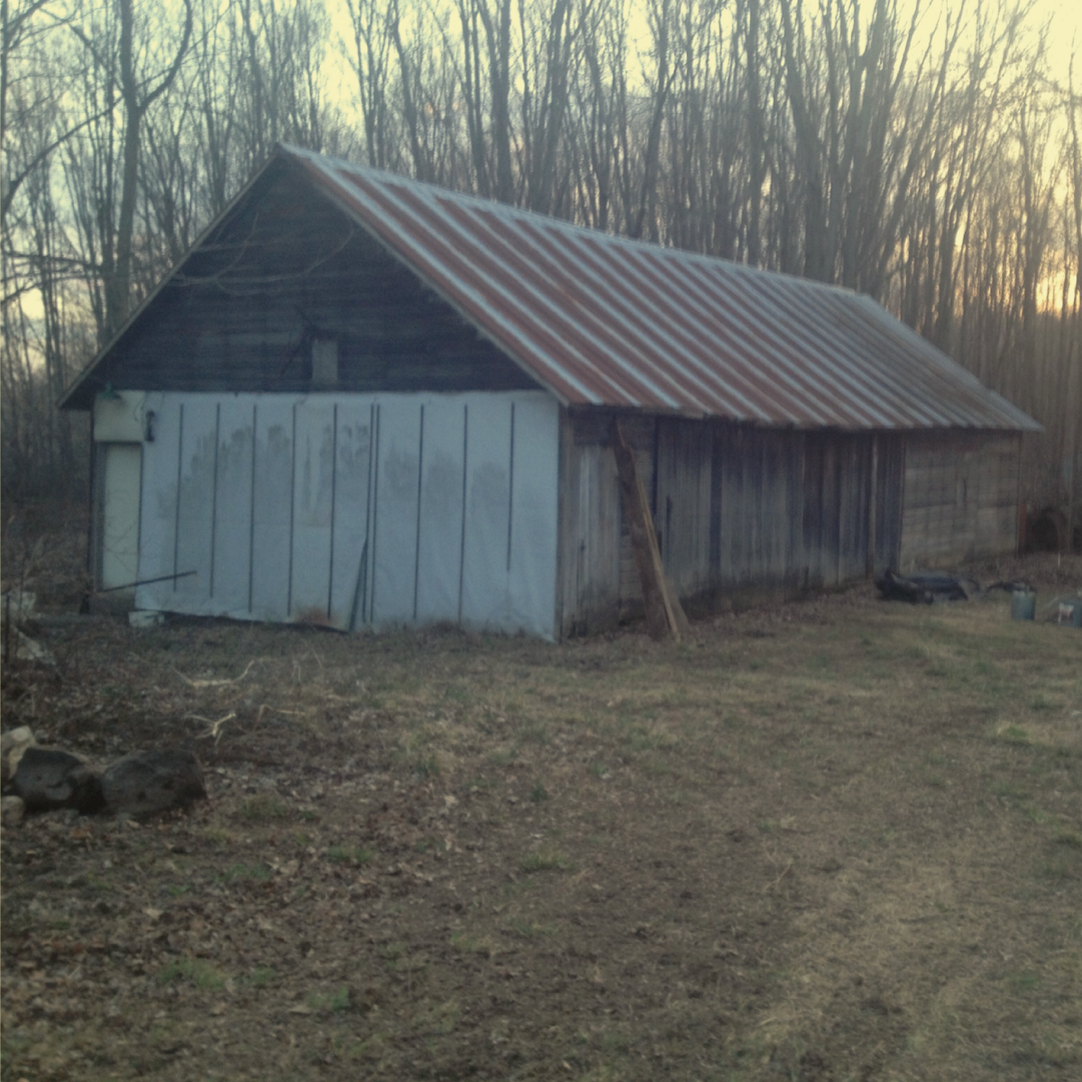
Farmhaus is a boutique, destination cidery, well-loved for their inventive varieties and wholesome, scrappy realness. They operate out of a 100 year old barn that they renovated by hand, nestled in the woods of West Michigan orchard country.

FUN FACT!
Farmhaus was my very first freelance client back in 2014. At the time they were two startlingly ambitious, cider-obsessed, full-time accountants figuring out how to DIY an ancient barn into a production facility and taproom on nights and weekends. They had two working recipes and I had been legally allowed to drink for just two years.
<< Weekly meetings at Founder’s were a joy.
They initially contacted me to tighten up an existing can wrap template design, and I slid in some logo tweaks because I just had to, okay?
(see below)
Once we had cans to sell, orders started rolling in faster than anticipated. With that rapid growth came needs for business cards, sell sheets, keg collars, signage, website, video, photo, social, print ads, shelf tags, more can designs… the whole gambit. So I learned how to play creative department while they worked their tirelessly to meet demand.
Provided Logo
I was originally asked to use this logo as is, but I saw some issues with the weight, tracking, and the lack of ownability that Pacifico lends as a font unaltered. They cautiously agreed to minor adjustments.
Inspiration
I took inspiration from one of the tractors on the property. ‘Ford’ is extruded from the metal, then painted over the extrusion. This softens and slightly opens the inner corners of each connection, and creates more weight variation. I also truncated the F for a subtle, balancing, custom detail.
Logo Tweaks
The final product was close enough to the original for comfort, but a bit more ownable and worn-in, with improved knock-out legibility.

Provided template design

Tightened-up template design

6 years, a few emergency room trips, and miles of red tape later, their big dream had transformed into a pillar of the Michigan Cider market.
In 2020, they invested in drastically expanding their production facilities to increase distribution. While the original branding had gotten them here, they determined that sitting on the precipice of more rapid growth warranted a big update.
Thus began my first journey in rebranding my own work.

The first thing I needed to do to get a sense of direction was research. So I tailored specific questions for each audience, and collected feedback. We posted links to Typeform surveys for their followers, we emailed vendors, interviewed distributors, and collected printed surveys at industry events.
I did a complete competitive analysis through both primary and secondary frames of reference. We researched market trends. We discovered our points of difference and parity and formulated personas.
We looked at where we are and where we want to be, then aggregated and analyzed the data collected, discovered why we’ve been successful thus far, how we can build on that, and voila. We had a roadmap.

Key insight:
They come for the cider, they stay for the heart.

Logo
We wanted to maintain the recognition we’d built upon the original logo, so keeping a pseudo-vintage script was a must.
I hand-lettered this new logotype to feel more authentic and delicious, with soft, fluid connections and a more iconic F.
The emblem shape we had before was rigid, mechanical, and generic. I improved the ownability through flexed lines and subtle x-axis asymmetry.


Packaging
3 tangible findings:
Price point was a pain point for 16oz 4 packs, but an increase for 12oz 6 packs was gravy.
Hierarchy and color needed work. Fluorescent cooler lighting reflected too brightly on the small glossy white type laying over the busy background textures.
Our basic plug-and-play templates were just plain boring (but we kind of already knew that).
Packaging Insight:
Cider sits snugly between beer and wine in consumers’ minds. Generally, the hierarchy for microbrew labels prioritizes specific beers with the brewery logo sitting back. Wine is the opposite.
Beer trends masculine, wine trends feminine. Cider in general trends slightly feminine, but Farmhaus’ audience was 75% female.
Rather than leaning into that demographic full-force, they wanted to broaden their appeal to beer drinkers. So we took the approach of a microbrewery.
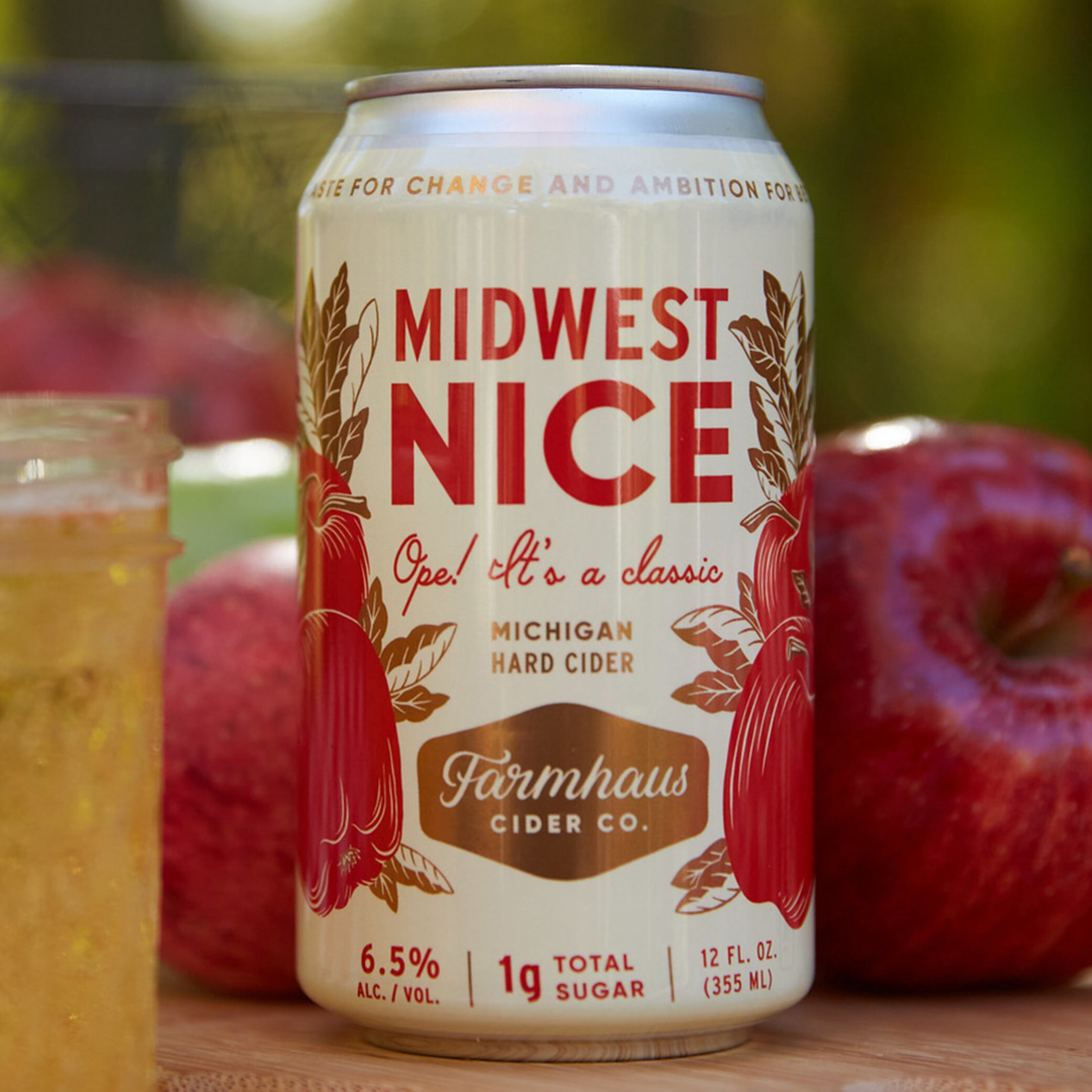
This meant creating ‘mini brands’ for each cider, with unique, memorable names, custom illustrations, and a more light-hearted approach to their voice in general.

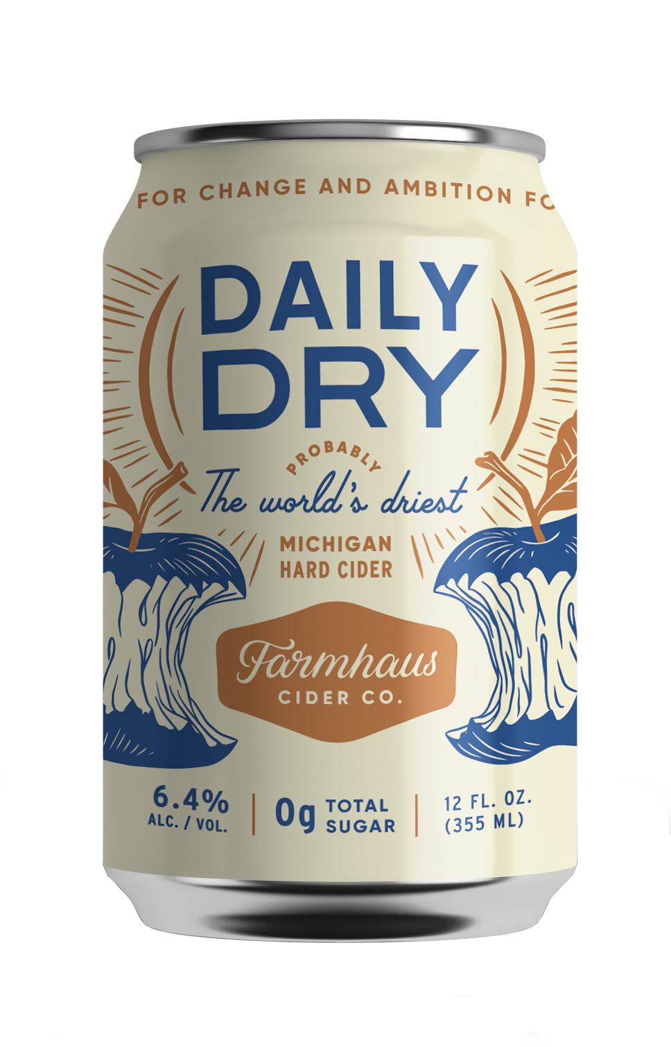


Farmhaus has a deep passion for bone dry ciders, and that shines through in most of their main stays. However, when seltzers exploded onto the market a few years ago, John had the idea to compete with a low-abv session/shandy style cider. Half cider and half lemonade, this line is absolutely delicious — and extremely popular.
We went with a way more feminine, playful, treat-like vibe for these. Somewhere between a wine cooler and a seltzer.


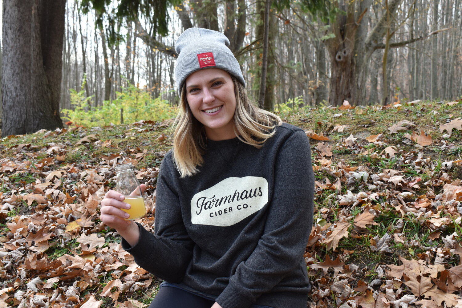
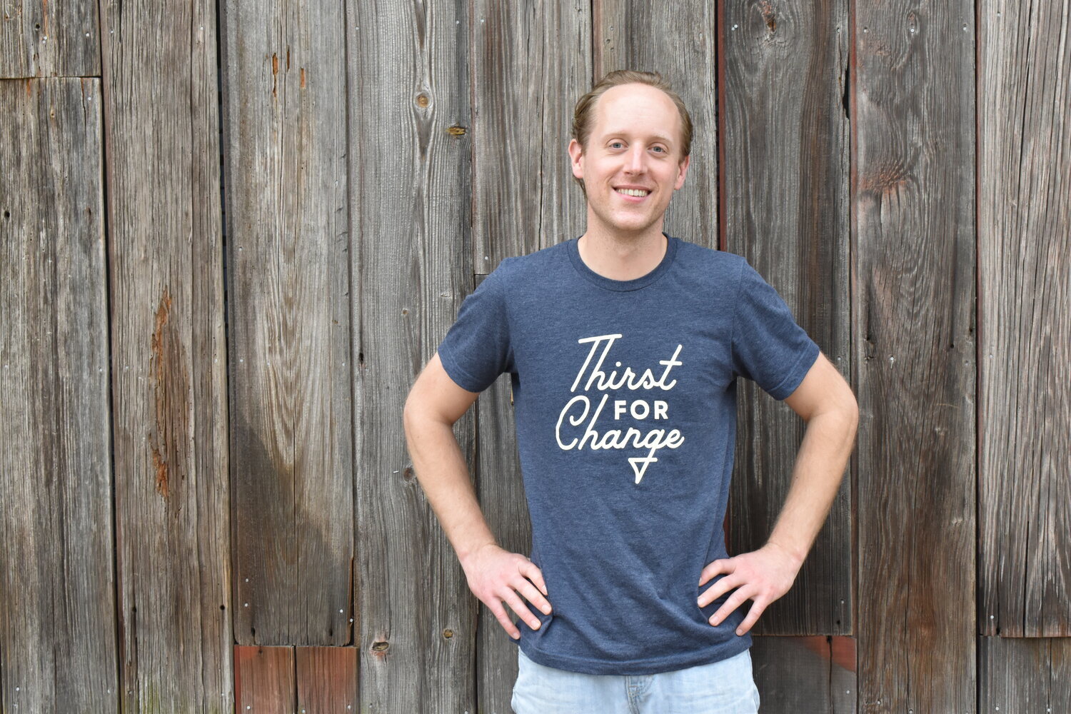
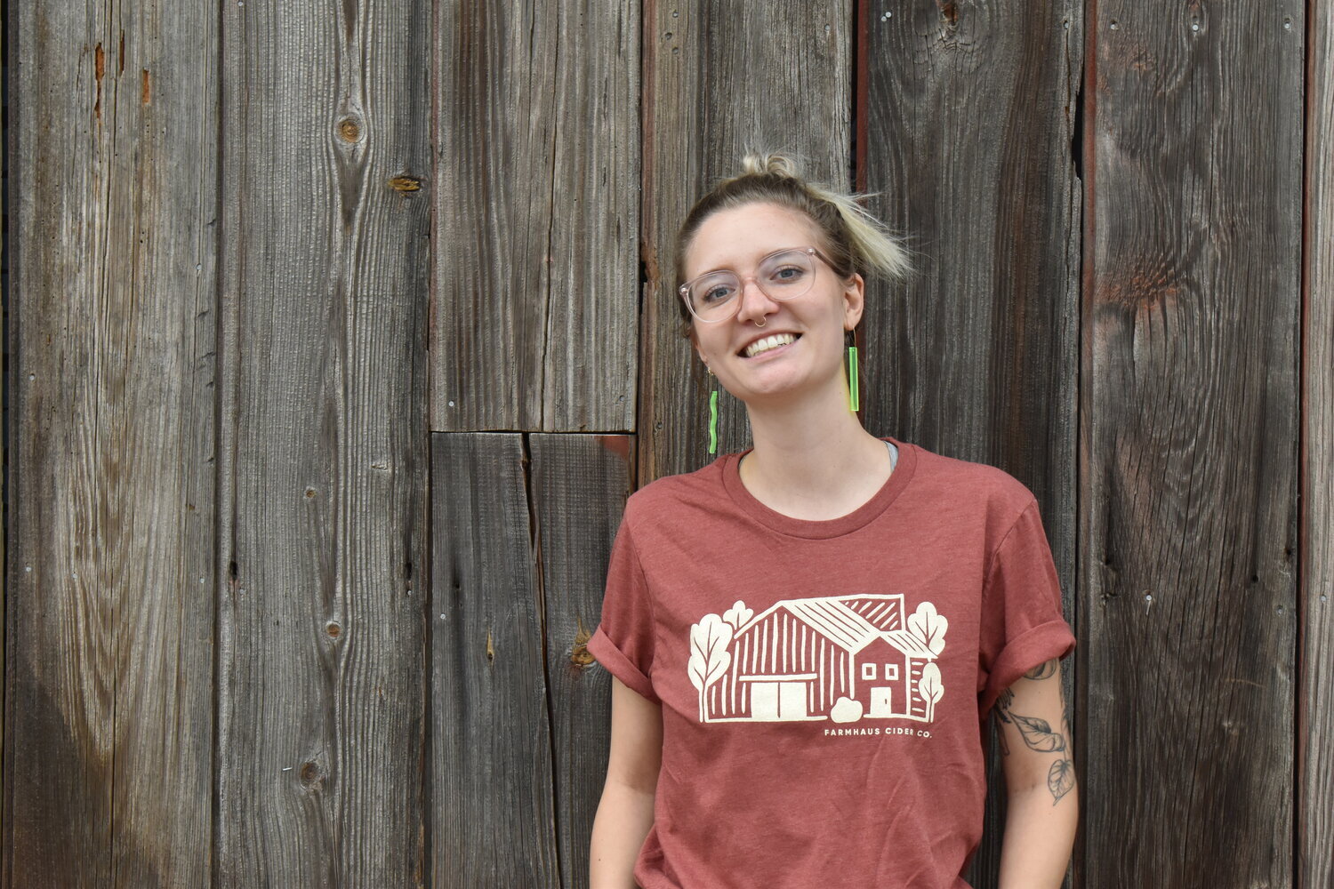
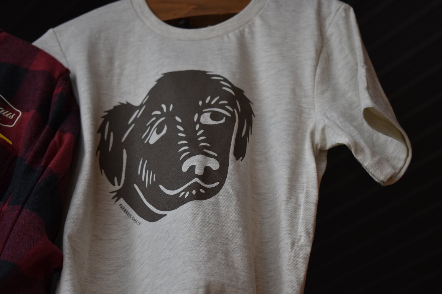
Can’t forget merch

I also helped design their website, check it out here.
I swapped out a basic ‘About’ page for an opportunity to shine a vivid light on their story. That way, new audiences can really get a sense of the heart that keeps their people coming back.
All of the essential ‘About’ info is all over the website, anyway.
Lastly, rollout.
We made 2 posts per day for 6 days, one to mark each chapter of their story, one with a stack of photos from that chapter. They acted as teasers building hype for a big reveal, and engagement was atypically high. On the 7th day, we announced the new brand.