Schuil Coffee Co. | Branding, Packaging, Lettering, & Web Design | Contracted through Assemble, then solo
Charlie and the Coffee Factory
Schuil is a specialty coffee roaster, distributor, and cafe, loved for their wide variety of indulgently flavored beans, and their legacy as the first shop in Michigan focused on high-scoring coffees.
Background
Garry Schuil was traveling abroad in the 70’s when he experienced a magical cup of coffee. Unlike anything back in Michigan, these beans were sourced, roasted, and brewed with artful precision. In 1981 he opened Schuil Coffee Company where he imported, roasted, and brewed the best Arabica beans he could source.
When Tim Volkema took the reigns in 2018, he had big plans. With a background in tech and a deep love for coffee, he understood the untapped potential hiding behind this unassuming cafe. 40 years of building this business from a place of deep passion for quality product had resulted in a top-notch facility, great supplier relationships, and a masterful staff. It just needed a plan and a brand to kick it into high gear.
Old branding below

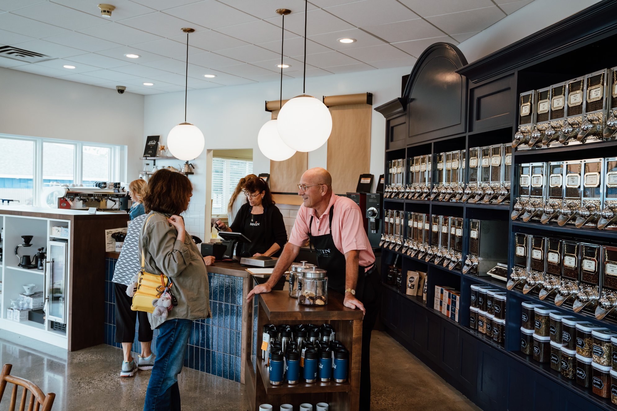
I was initially contacted to redo their logo to feel more classic, indulgent, and welcoming. I took inspiration from the physical location. Vintage dispensers filled with a hundreds of varieties line the walls of the cafe.
It kind of feels like walking into one of those old-school, small town candy shops to buy some saltwater taffy because you’re on vacation — but it smells like coffee, because everything is coffee. So I channelled that vibe.

Process


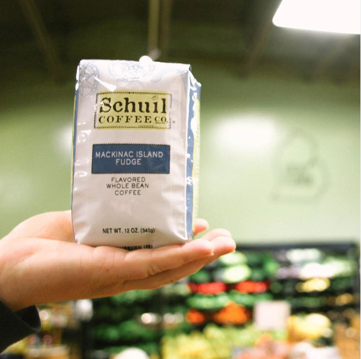
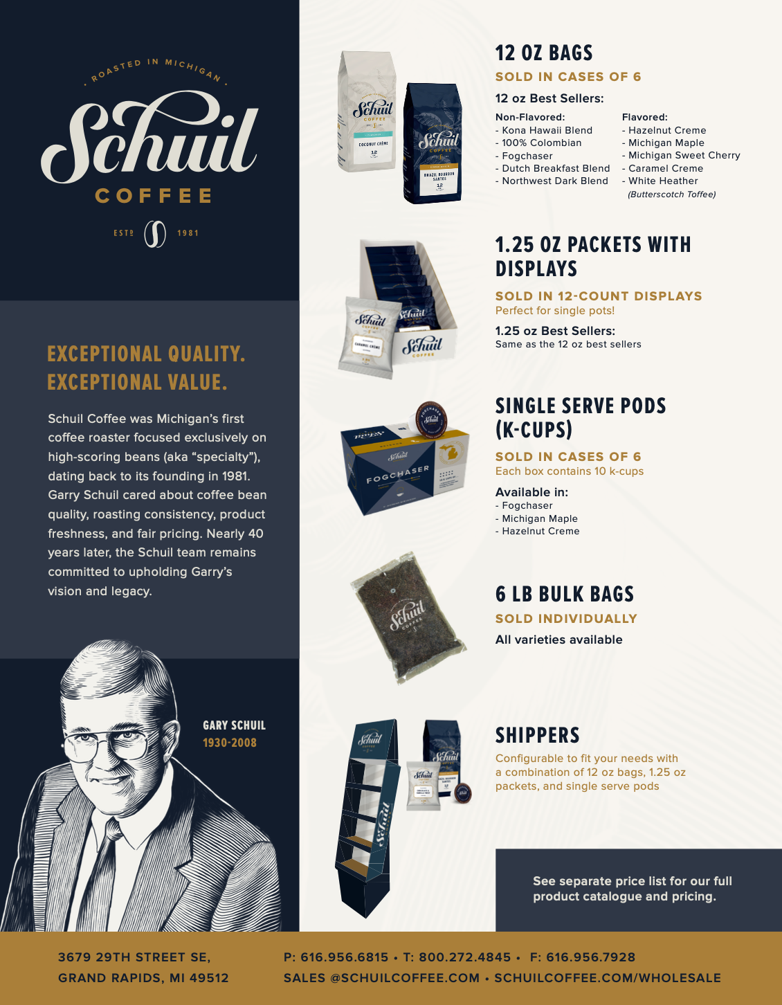
Packaging - 12oz bags
They needed two bags for flavored and unflavored, with a label system that could accommodate hundreds of varieties. The labels also had to be rapidly customizable with the rigid, low-tech software that operates their in-house label printer.


The bags have an opaque, satin finish, with cut outs through to the raw substrate behind the gold details. This made those areas metallic, almost like a foil stamp. I also added a spot gloss to the logo for a textural element. These print choices brought a cost-effective, premium feel to highly templated bags.

I decided to break the flavored coffees up into 5 brightly colored categories (chocolate, nutty, spiced, cream, and fruit). This helped show variety within the flavored bags at a glance, without relying on excessive colors or cumbersome imagery.


I helped design their website too. Check it out here.
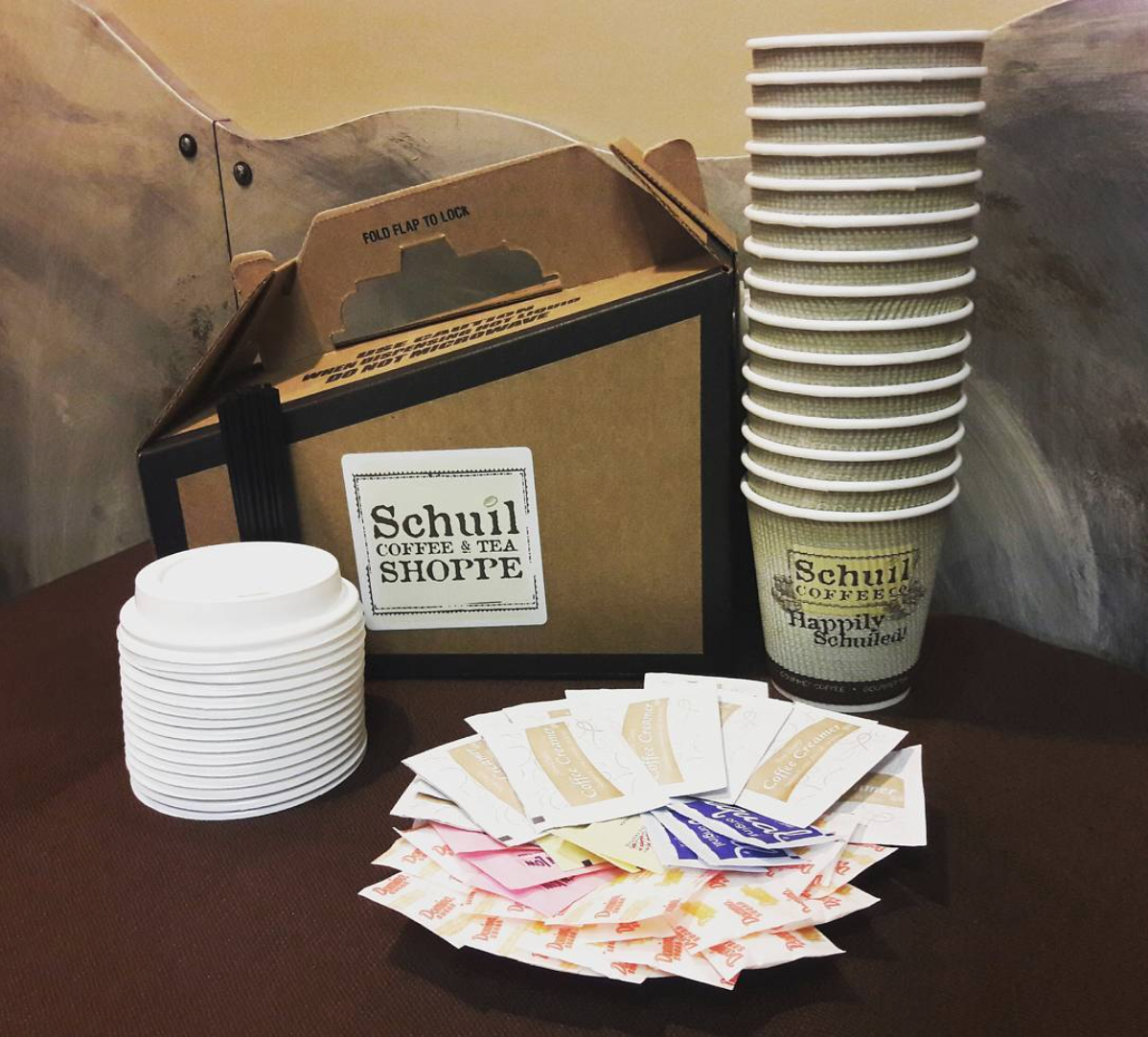
More Print Materials


Cafe
The renovation was informed by my branding work, but I did not make all of these decisions. They just did a stellar job weaving the brand through the physical space.


