Sparrows Coffee | Logo, Packaging, Naming & Copy | Contracted through Assemble, then solo
Getting into our feelings.

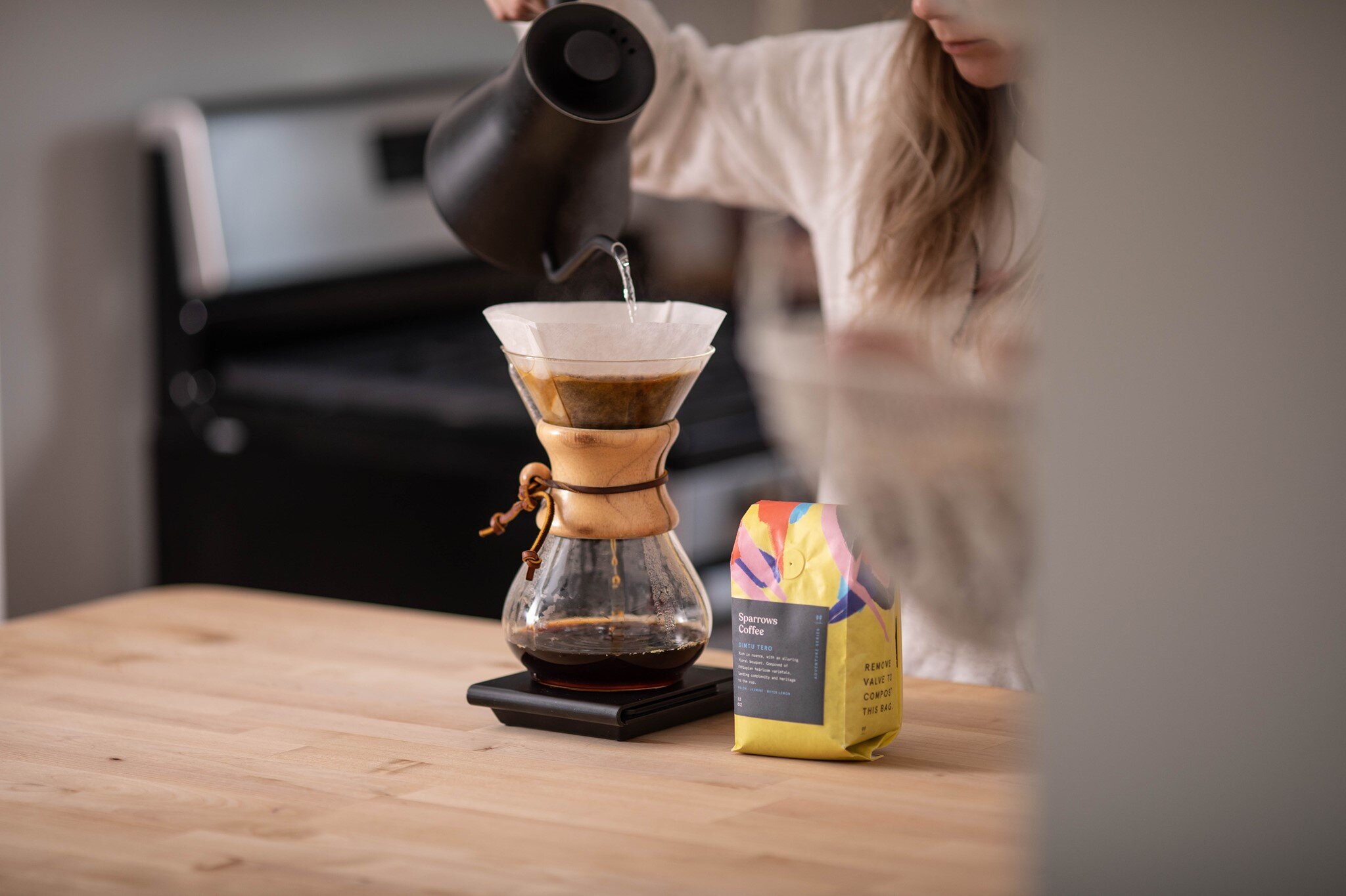
Sparrows is my favorite coffee shop in Grand Rapids, MI. They are loved for their cozy, eclectic location and their expertly roasted brews.
Background
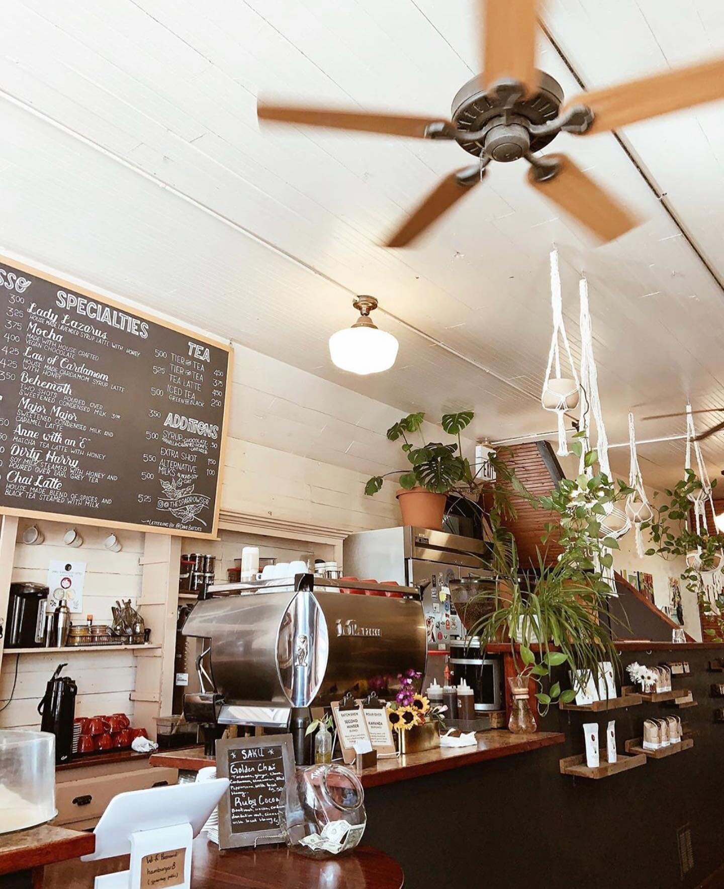
The Sparrows has been around for what feels like forever. It lives on a cobbled red brick road amidst neighborhood bars and 100 year old homes. Cars drive slowly past. The original hardwood floor boards are worn, and creak familiarly as tenants find their seats. There is a humble library of zines, books, and board games facing the counter, and the wall facing the entrance is a rotating local art gallery. The place is teeming with whimsical plants and quiet conversations. It smells like books and rain and warm coffee, and it is absolutely as charming as it sounds.
Oh, and the coffee is top tier, too.


Once Schuil 2.0 took off, Tim set his sights on The Sparrows. This place had popularity and quality down, but the only way to buy their beans was to come into the cafe. With the power of Schuil’s infrastructure, Tim’s vision was to turn Sparrows into a boutique roaster with broad distribution.
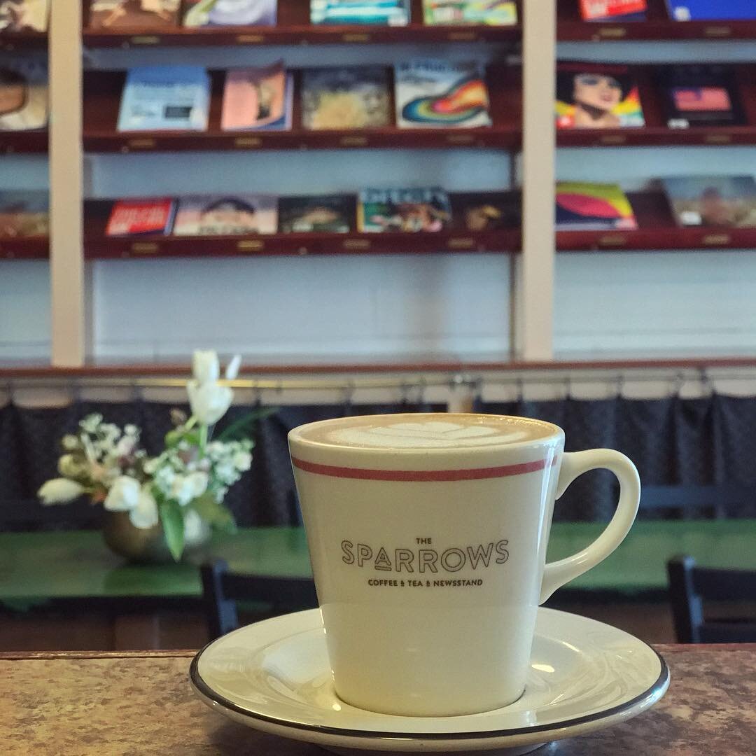
Original branding below.
The Sparrows’ coffee quality is on par with the 3rd wave, clean-lined, technical (re: pretentious) coffee shops popping up everywhere. But it’s the warmth and spirit of the place sets them apart. Sparrows is all about the feeling. So we ran with that.
Naming
‘The’ Sparrows worked for their quaint, brick and mortar location, but it felt out of place on a website like Trade. I also knew from experience that nobody actually called it The Sparrows. Inviting someone to meet you there sounds like, “Wanna do Sparrows?” So we nixed the ‘The’, and no one flinched.
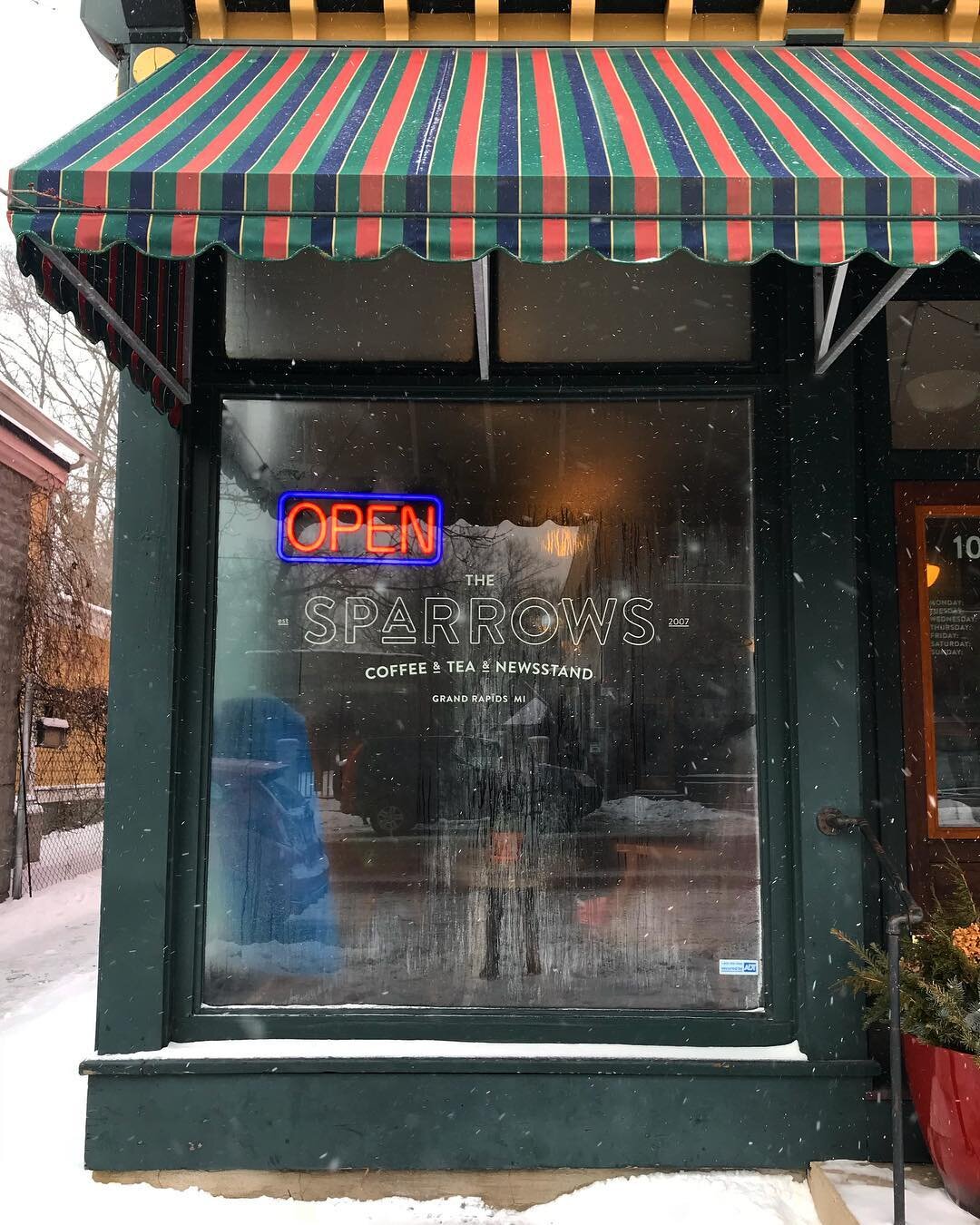
Logo
Translating the warm, whimsical, timeless, and familiar feeling of the space to distant, virgin eyes was the goal. So I looked for a serif that feels lived-in but still current, with quirks. Recoleta hit that sweet spot. I then introduced softer darks and lights and incorporated their beloved bean pods, and voila!
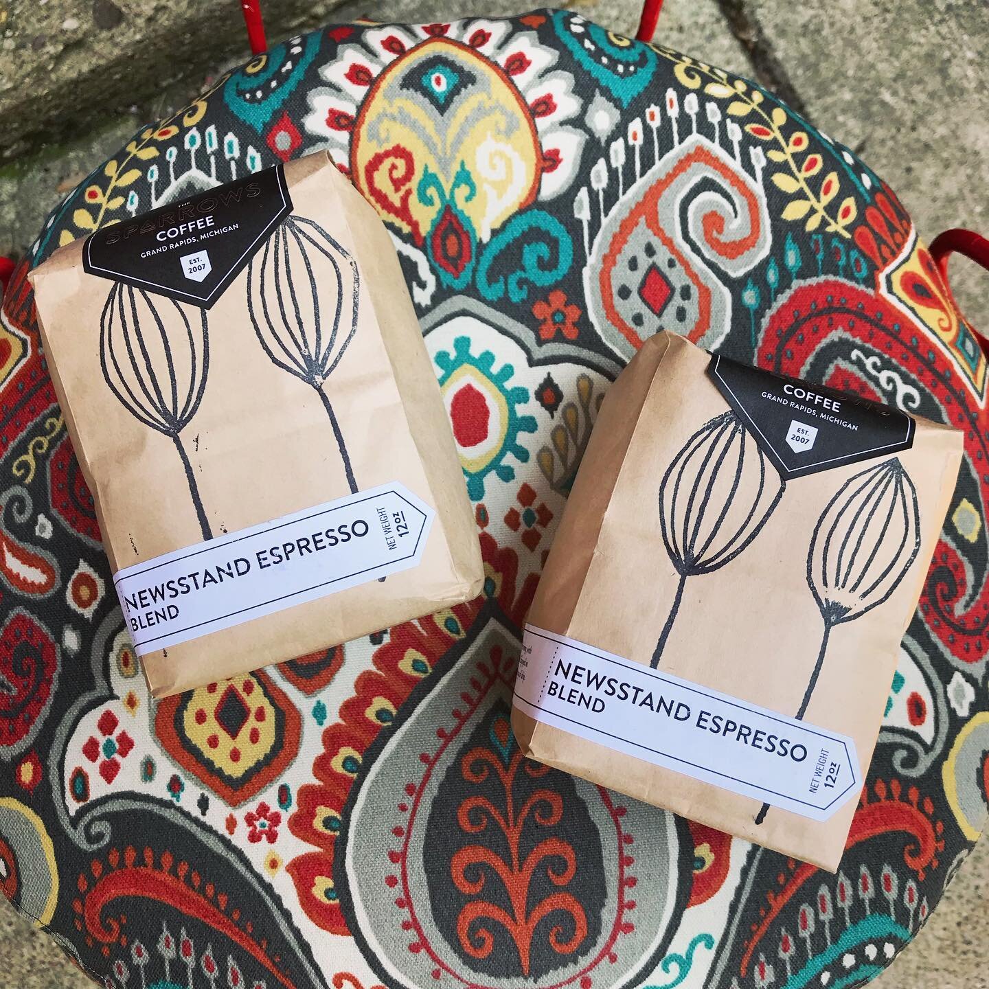
Voice & Packaging
Rather than go the direction of our 3rd wave competitors, with pristine labels touting nitty gritty details like elevation and latitude, we sorted their varieties into 3 feelings that different beans and blends evoke.

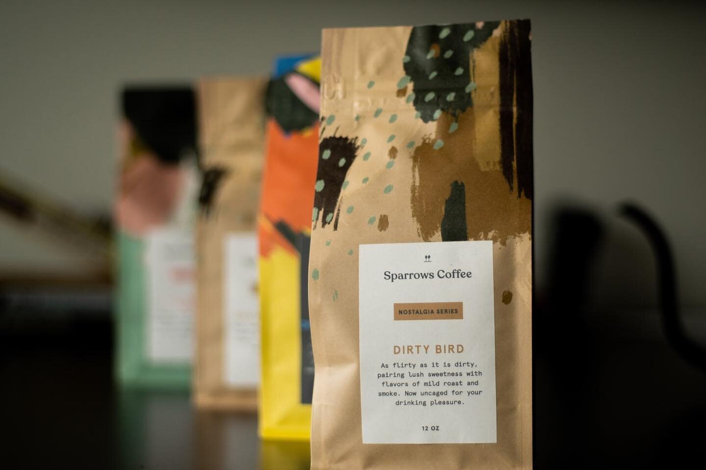
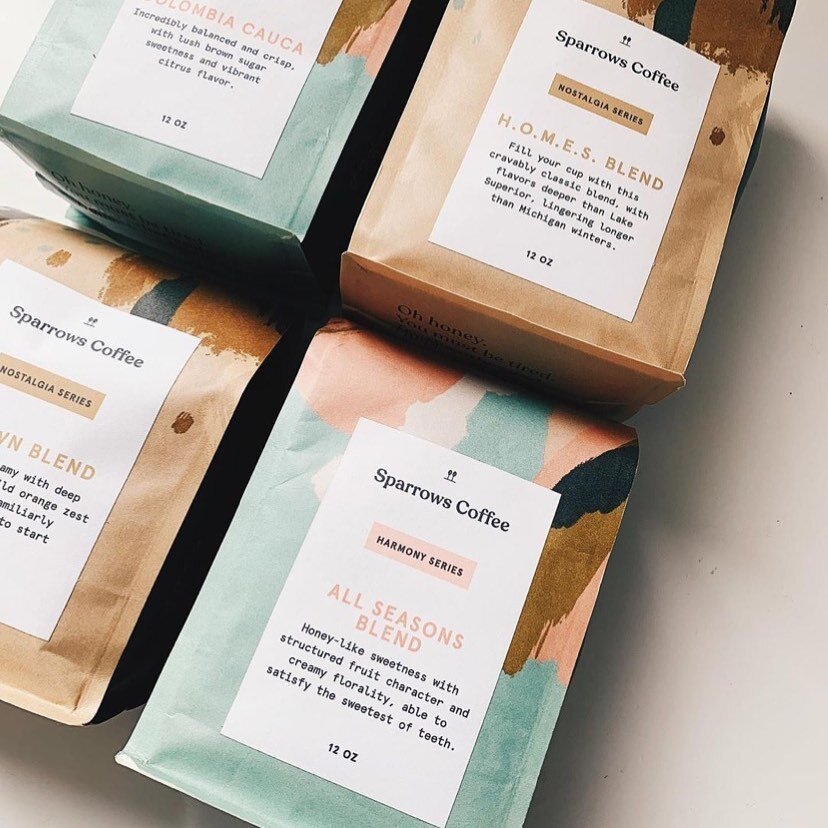
Nostalgia
Nostalgia coffees are deep, sweet, and rich, and bring us back to the coffees we grew up drinking.

Harmony
Harmony coffees are sweet, crisp, and crushable all-day drinkers.

Adventure
Adventure coffees will take many drinkers out of their comfort zones, with more wild flavors and higher levels of acidity.

Inspired by the mural on the side of the building, I created three loose, abstract paintings that embodied the different feelings with color, shape, and rhythm. We wrapped them around each bag.


Labels & Voice
Because the bags themselves have a lot going on, I decided to keep the labels simple. Writing the descriptions was our first exploration into voice. Sparrows shows their know-how with highly detailed profiles that they communicate with experience-centered, evocative language.

Explaining ourselves
Recognizing that emotional cues are atypical in this sphere, I knew we had to spell it out somewhere. So I used the space typically designated for describing the roaster to instead show who we are with light-hearted similes describing the experience of each series. These descriptions are different for each series, and the highlighted column corresponds with the bag in hand.

A little treat
I added this cute little easter egg on the bottom to add a personal connection to every inch of real estate. It has been very well received on Instagram.